
Are you a visual learner? Many people are. Almost all of us are to some extent, so it’s always worth thinking about how to play to that in a proposal. It’s always worth thinking about whether some information can be explained more clearly or presented more compellingly in a picture of some sort.
That’s it.
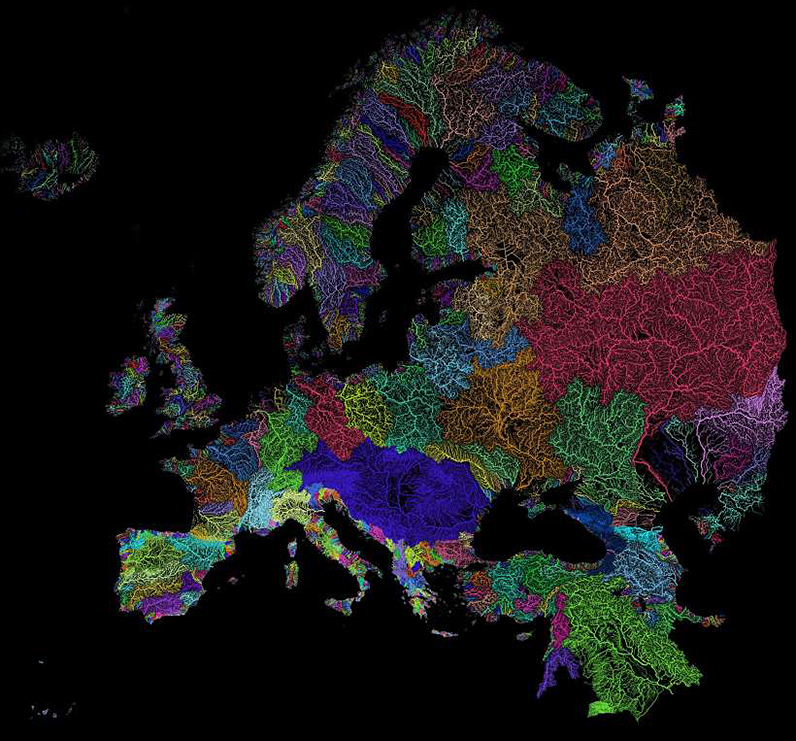
But to reinforce the message, take a look at these maps of the world’s watersheds and at the sample, below, for Europe’s river basins. And then think about the words that would be necessary to come close to communicating the same thing.
And besides, it just looks nicer on the page.
In my magazine editing days, we had noted designer Jan White give a seminar on the use of photos. He defined three classes of photos.
1. “Oh, by the way” photos. By the way, this is what the author looks like. Make the photo as small as possible, because it’s meaningless, irrelevant.
2. “Worth a thousand words”. Like your map of Europe’s watersheds, conveys more information, better, than 1000 words would or could. Make it no bigger than necessary. Unless it, itself, turns into #3,a grabber.
3. “The grabber”. Action, intensity, surprise, human interest. This is the photo that makes people stop and look. Make it as big as you can get away with.
Jim T
Jim – Ah, interesting. I have no training in the graphic arts, but I like that approach. If nothing else, it helps to focus your thinking on what you’re hoping to achieve with said photo or graphic.
P.S. Jan White was talking about magazine design. I don’t know how — or even if — his advice would apply to web pages, blogs, and screens.
Jim T
Thanks, caveat noted. 🙂