Writers are often enjoined to “show” not to “tell.” I often enjoined proposal writers to do both: Make it easy to “see” or grok your point, but don’t hesitate to also make it explicit in words. That was a result of being smacked up-the-head by marketers on Red Teams, insisting that all points be hammered home.
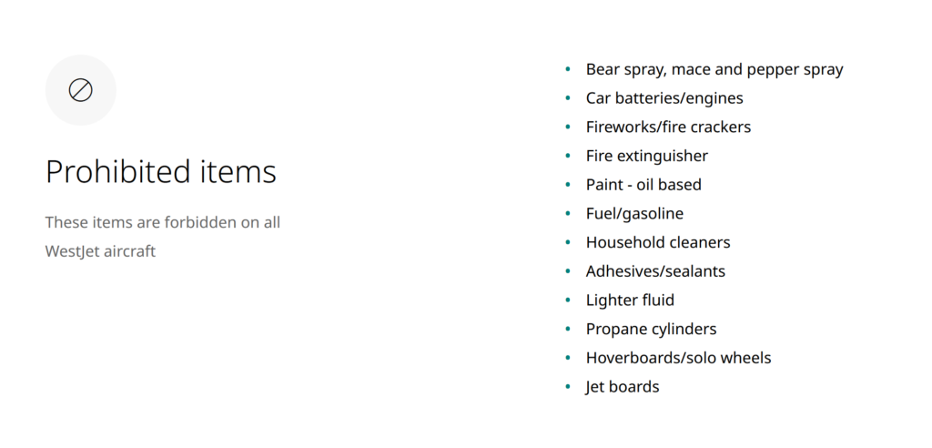
Checking in for a flight recently (remember flying?), I encountered a new-to-me user interface. One aspect addressed a complaint I’ve long had about airline communication around what’s OK to pack or to carry onto an airplane: A communication approach that requires way too much of the reader, IMO. Here’s the latest approach, at least in Canada.


Drat! Now I have to remember not to pack my avalanche-rescue pack. Anyway, I know this approach takes up valuable real estate in a page-limited proposal, but it’s worth using selectively.
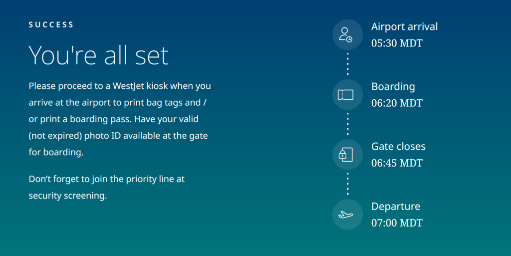
Another aspect offered me a visual summary of my upcoming airport experience: What should/would happen when. Nice, eh?

Now, this would have been more effective if it didn’t contradict instructions/information already given in text about how early to arrive at the airport during COVID-19 (2 hours before the flight, not 1.5 hours), or the departure time (now 7:15, not 7:00).
So that’s the last thing to remember: Keep your words and visuals consistent.

Would it also be possible to have airline announcements made in a language that all of us could understand?
Jim T
Jim T – Apparently Transport Canada doesn’t believe in that. They lay out the set pieces, I believe. I’d love it if they let me at for 10 minutes . . . There would be no more “floor proximate lighting” that’s for sure.